Autumn is our favourite time of year. Not just for the stews and crumbles that begin to appear, but for the explosion of beautiful and vibrant colour that can be found. As much as we love our neutrals, we need to feel the warmth that autumn hues bring inside and outside the house. There is no better king of the season than orange.

Cadmium Orange Throw from Ambunti Warehouse
Many people feel frightened of using such bold and vibrant colours; they worry it will be overbearing and too much. Orange conjures up Halloween and garish decorations, or clashing 70s colour schemes but it’s far from the case.
Burnt orange, terracotta, bronze, tangerine, salmon, amber, peach, there is far more to the colour than Trick or Treat buckets.
Every primary school child will tell you that orange is a mix of red and yellow, emotionally as well as literally. The vibrant, energetic stimulation of red mixes seamlessly with the sunny cheerfulness of yellow to create a warm, happy and even restful glow. In fact, the greater the yellow percentage in any colour, the more likely it is to evoke hope and optimism, which is always worth bearing in mind.
Watch Your Tone
To be technical for a moment, the more saturated the colour, the more vibrant and intense it will feel. The key then becomes what to pair it with.
A strong colour like orange works well with neutrals to keep it balanced. Cool greens with a muted grey undertone will be instantly brightened with a pop of burnt orange.
However, it’s worth giving some attention to the colour wheel. It is indeed true that opposites attract, so blue over on the other side of the wheel is a natural complement.
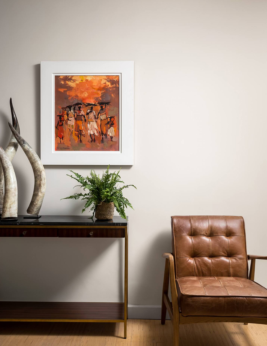
We used a leather chair that has orange undertones and some tonal cushions to make this teal room come alive.

Similarly, we love this bold pairing of dark blue and burnt orange, which is rich and comforting, rather than brash and overbearing.

As featured in Homes & Gardens
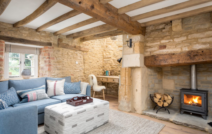
For a lighter feel in our Orchard House project, we used a touch of burnt orange to bring out the warmth of the wood in the furniture and beams.


“Living Coral” was selected as the Pantone Colour of the Year in 2019. It’s a confident colour with echoes of summer, and looks particularly good with blues and whites.
Other colours can also work wonderfully, such as those that lie on either side of it on the wheel, whether that’s shades of green, red or yellow. You only have to look outside at the autumn foliage to see how they work together. The key, as with all things, is getting the tone right.
A soft orange can break up a strong colour, whereas this mid-Century inspired corner creates an altogether more cheerful feel.

Orange vase from W A Green
On the other hand it’s soothing warmth can also soften much darker, harsher colours. This calm salmon colour brings a smokiness to the grey woodwork.
The gentler shades of orange, such as peaches, apricots and salmon all pair perfectly with creamy and ivory. Peaches and cream doesn’t just taste delicious, it’s a colour sensation. These combinations perfectly suit period styles and can be found in the finest stately homes.
")
Buttered Yam from Benjamin Moore

Paint by Benjamin Moore
It’s What You Do With It That Counts
Orange can work in any setting, in any intensity, with some careful thought.
Think about the light in your rooms. A soft terracotta shade can look like a glorious Tuscan sunset in one room, or a mud bath in another.
It’s not a colour that we naturally associate with sleep, so think carefully about using it in the bedroom. It can certainly be done very successfully, but stick to more muted, restful tones.
This hotel in Devon uses a dark caramel velvet to add a little luxury, and these layers of soft terracotta give a bright but cosy feel.
Image: Gara Rock Hotel, Devon

As we hope we’ve shown, you don’t have to cover all the walls to give orange a starring role. Use orange as an accent colour on soft furnishings such as throws, blankets and cushions, as well as rugs and upholstery.


This opens up a world of luxurious fabrics and prints too. We love these fabrics from Kravet.com which both, in their own way, bring a little nature indoors.
Don’t feel that textiles are your only option though. Different woods, copper and ceramics can all provide a focal point. It can be incorporated in the sublest of details, which are barely noticeable but tie a room together. It could be the hint of tuscan sun in a painting, or a printed lampshade.
These lights from Tom Raffield manage to be both subtle and eyecatching.

Image credit: Penguin Books
We hope we’ve convinced you that orange is not just for Halloween, and if you’ve like to talk through your ideas, do give us a call.
Happy Halloween!
From Jane & Helen

Light by Tom Raffield
Vases, mugs, pieces of pottery can all make a statement, your vintage book collection could even be the inspiration,